

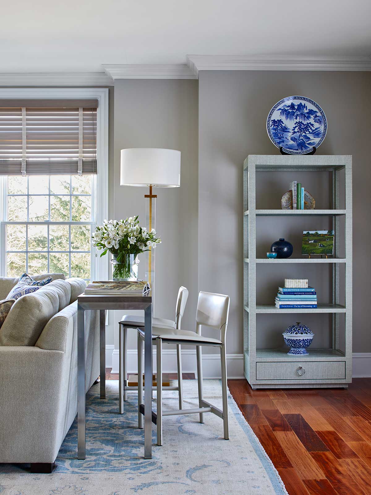
As much as we love to have fun with bright hues, there is a time and place for soothing neutral colors to become the star of the show. Below are some of the go-to shades we use when we are working with a client who has a preference for a more calming color palette. These neutrals also work great to highlight those gorgeous architectural details in a home and allow other colors and patterns in the area to pop.
When it comes to picking a neutral paint color for your project, it’s so important to take the time to select the right shade for the space. So The Red Shutters principal designer, Marina Case, has some tips to help you avoid paint selection pitfalls.
How to Pick the Right Neutral Paint Color
Using a neutral paint color while avoiding creating a drab, dark room requires delicate balancing – and samples!
“Choosing the perfect neutral paint color really depends upon the intensity of the light in the room,” says Marina. “You really have to read the light, both natural and artificial, and see what it’s going to do. And you can’t tell that without large paint samples. We order large paint samples for every project. They are included with all of our design packages so our clients can really get a feel for how the color will work in the room.”
How do you even start with selecting color swatches? “Generally, you should begin with one of the larger elements in the room, such as the carpet or sofa fabric, and use them as the guide for the paint color,” advises Marina.
Our Go-To Neutrals
Neutrals are really muted shades of color that have underlying tones that change with different lighting. The traditional neutrals are black, white, brown and gray with varying shades in between. But recently, there has been a return to yellow as a neutral.
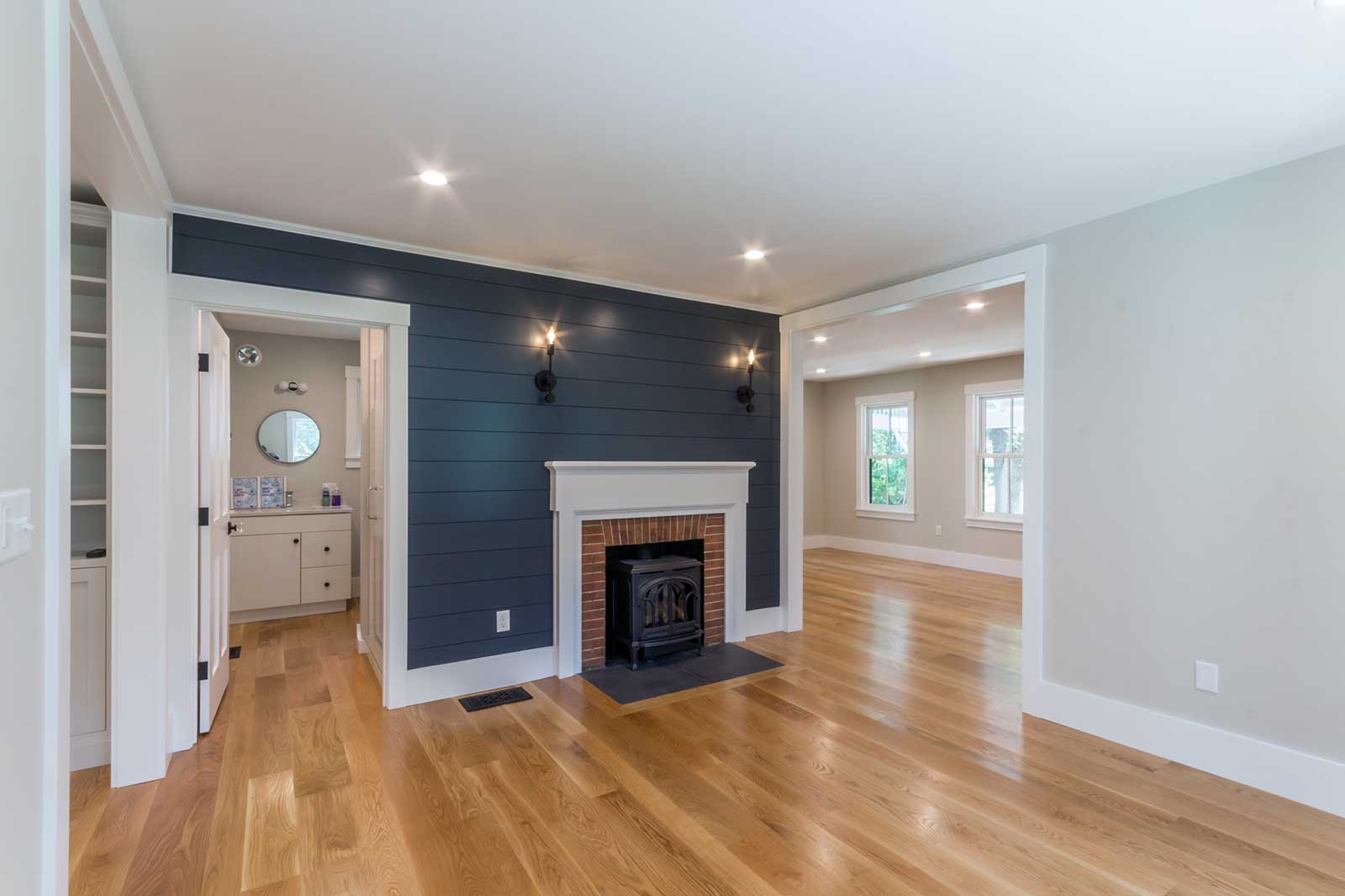
“For our younger clients, yellow is a popular neutral wall color, like Benjamin Moore’s Pale Moon, which we are currently using on a project in Warwick, New York, and contrasting it with a pop of blue on the bookcases in the room,” said Marina.
We have a robust catalog of neutral paint colors we rely upon time and again for our projects. Here are some of our favorite go-to’s:
Everything in the Benjamin Moore Off White Collection! But, we are particularly partial to:
• Balboa Mist – a more gray neutral
• Simply White – a more modern hue with a slight hint of yellow that works as a good basic white
• Edgecomb – a go-to neutral with a warm, welcoming feeling
• Revere Pewter – a lot of strength, without being too cool
• Classic Gray – a more modern, cooler gray
• White Dove – a super neutral white with a slightly off-white color
• Parish White – a classic from the Williamsburg collection


The Neutral Color Palette will give you an idea of the colors we favor, followed by their use in some of our interior design projects.
British manufacturer Farrow & Ball also makes some of our popular picks, such as their Farrow’s Cream, which is a traditional cream color.

Ready to Get Started Transforming Your Space?
There are so many ways in addition to pattern to breathe fresh life into a home. View my Portfolio to see more examples of my interior design projects and follow us on Instagram for more interior design inspiration.


