By Marina Case
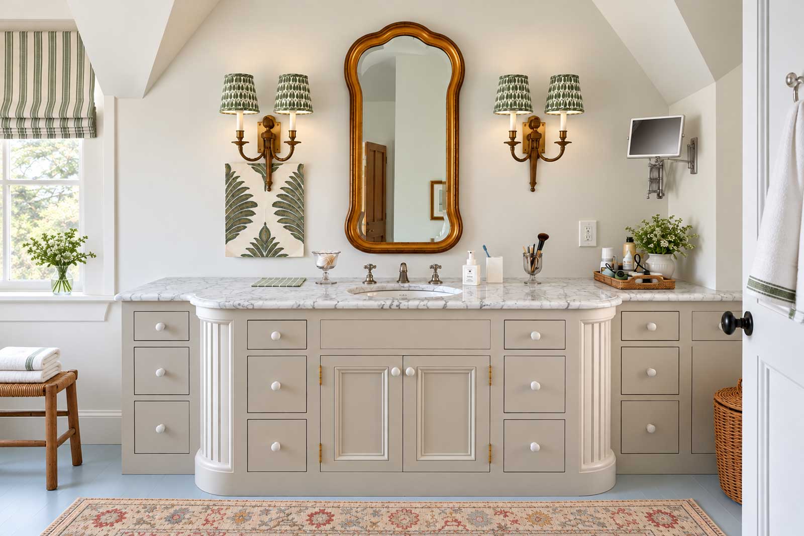
One of the things I love most about wallpaper is how much personality it can bring to a room. Whether it’s a bold botanical print or a delicate repeating motif, wallpaper instantly makes a space feel more interesting and fun. And with so many beautiful patterns to choose from, I tend to aside samples for myself while browsing collections for clients.
Since moving into my Martha’s Vineyard home, I’ve been playing with color and pattern, drawing inspiration from the island’s natural beauty. Some of my wallpaper choices were inspired by the surrounding landscape, others simply caught my eye and I knew I had to find a place for them. And while some decisions came easily, others have taken a little more time. Let me show you what I’ve been working on!
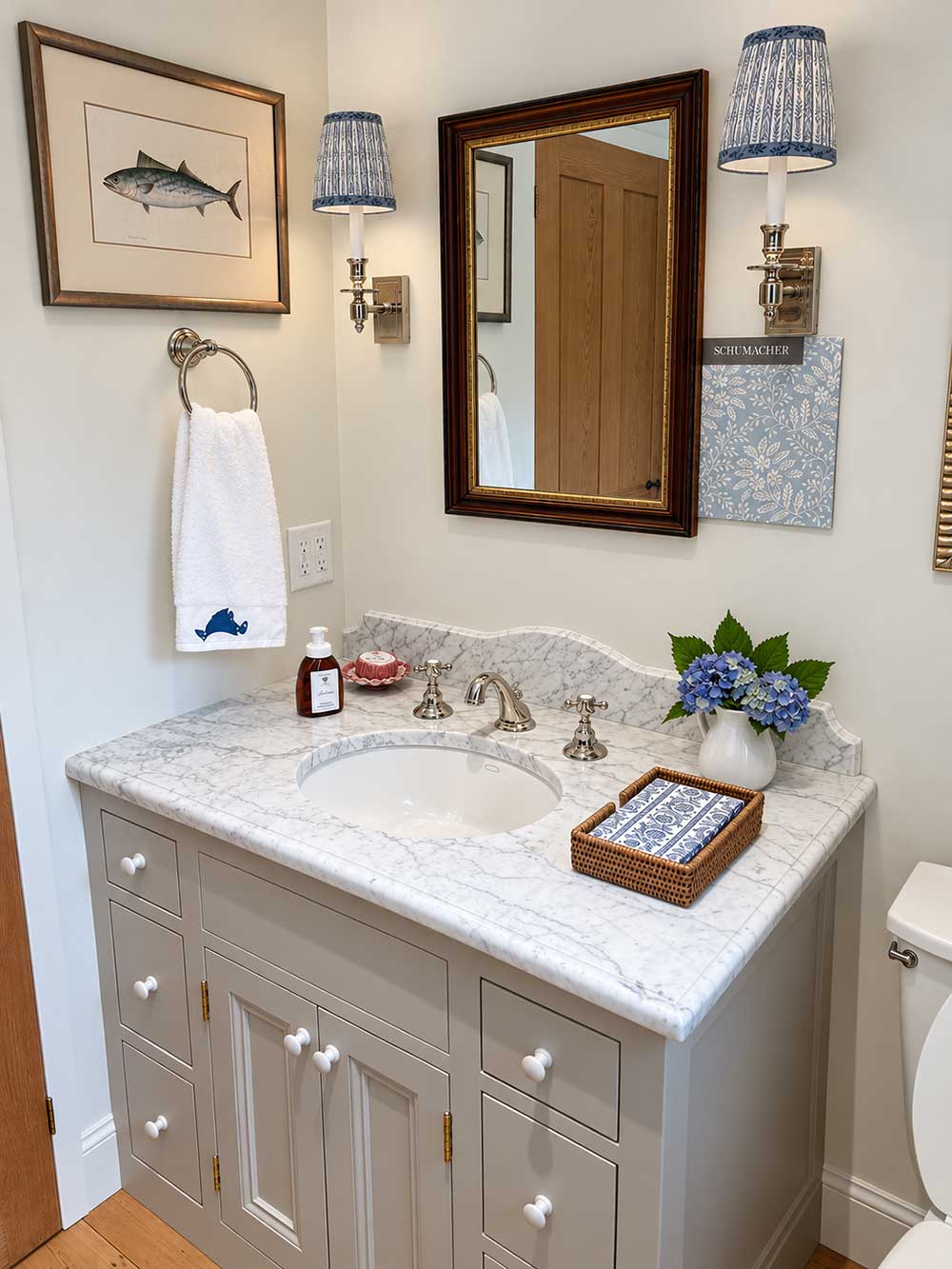
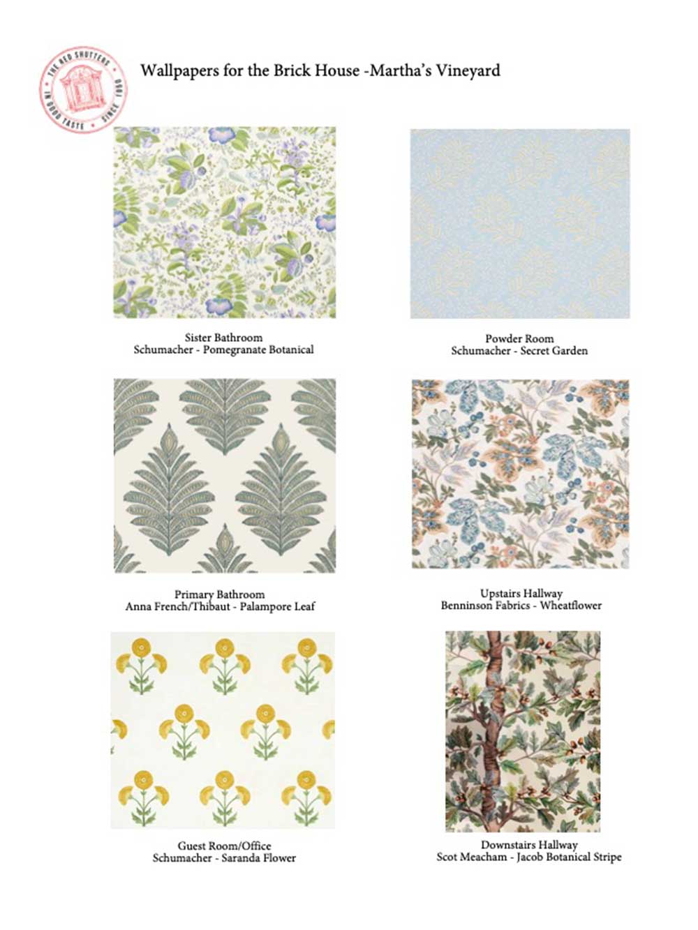
Powder Room: Schumacher – Secret Garden
For the powder room, I knew I wanted wallpaper that would envelop the entire space, with a dense, organic pattern and a strong background color. What I didn’t know was exactly which color I wanted.
I started by hanging a few samples in coral and blue, but nothing felt quite right. Then I discovered Schumacher’s Secret Garden, a beautiful pattern in calming shades of blue, green, and white. I hung a sample on the wall, and several years later, it’s still there! Almost everyone who walks into the room comments on how much they love it, and I haven’t grown tired of it either.
The pattern has an almost hand-blocked feel, with organic shapes and colors that remind me of the oak trees, brush, and plants I see on my bike rides. I wanted something with plenty of pattern and interest, but that still felt subtle enough for a beach house, and this paper has just the right balance.
Primary Bathroom: Anna French/Thibaut – Palampore Leaf
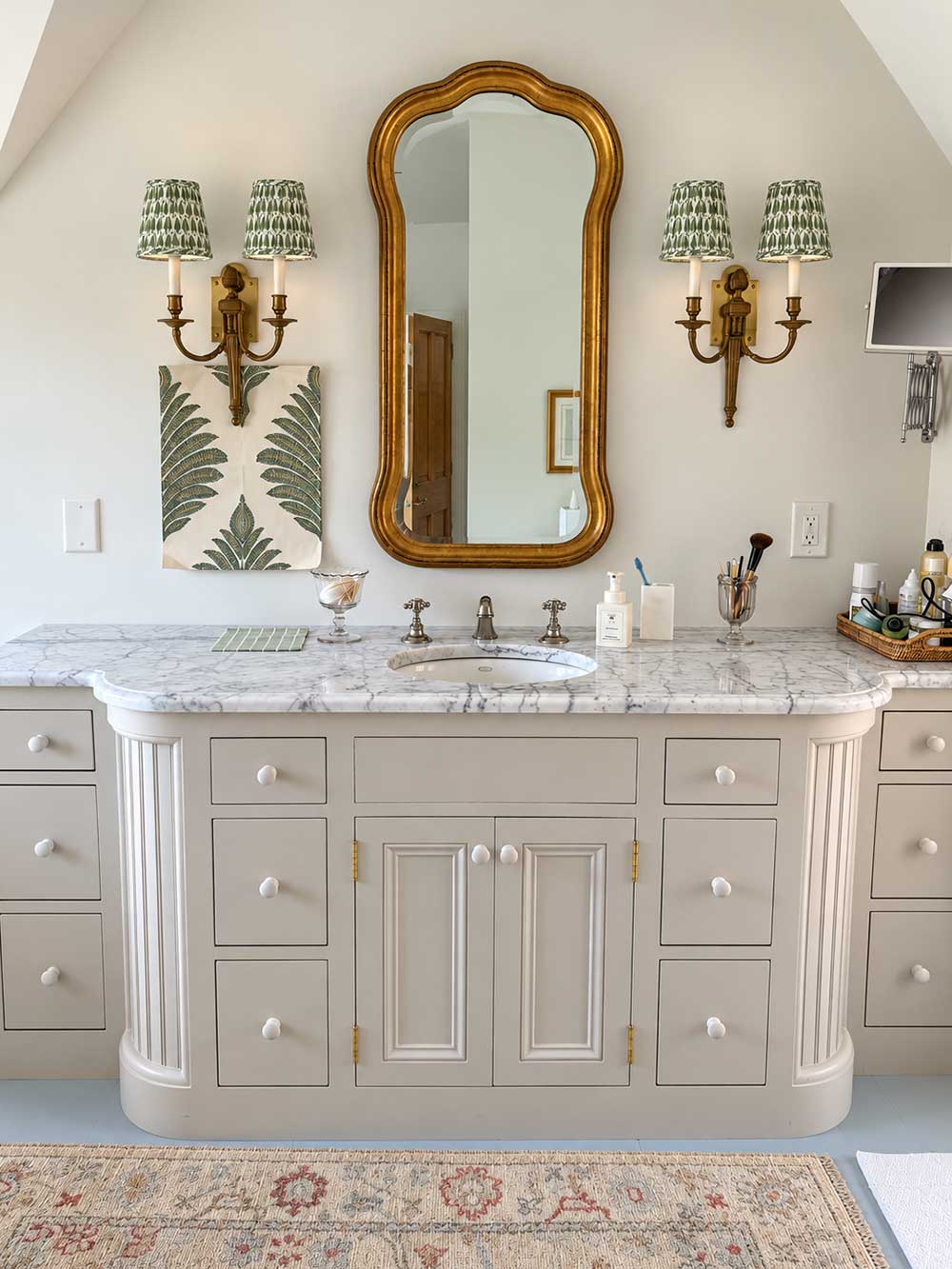
The wallpaper I’m considering for my primary bathroom is actually one I originally pulled for a client. I loved it so much that I set a sample aside for myself, knowing I wanted to use it somewhere in my own home. The pattern is Palampore Leaf by Anna French for Thibaut, and it’s been hanging in our bathroom for about three years now.
One thing you should know about decorating our home is that I’m not the only one making decisions! My partner is a designer, builder, architect, and engineer all rolled into one, and he always wants to have a say. So not only do I have to love a wallpaper, I have to get him to agree to it, too. Fortunately, he loved this one as much as I did. After years of looking at the sample, we both still love it, which tells me it’s a good choice.
The question now is how much of the bathroom to wallpaper. I’m still deciding whether to carry the pattern throughout the entire space or use it more selectively. So this one is still a work in progress. Follow along to see what I eventually decide!
Guest Bedroom and Office: Schumacher – Saranda Flower
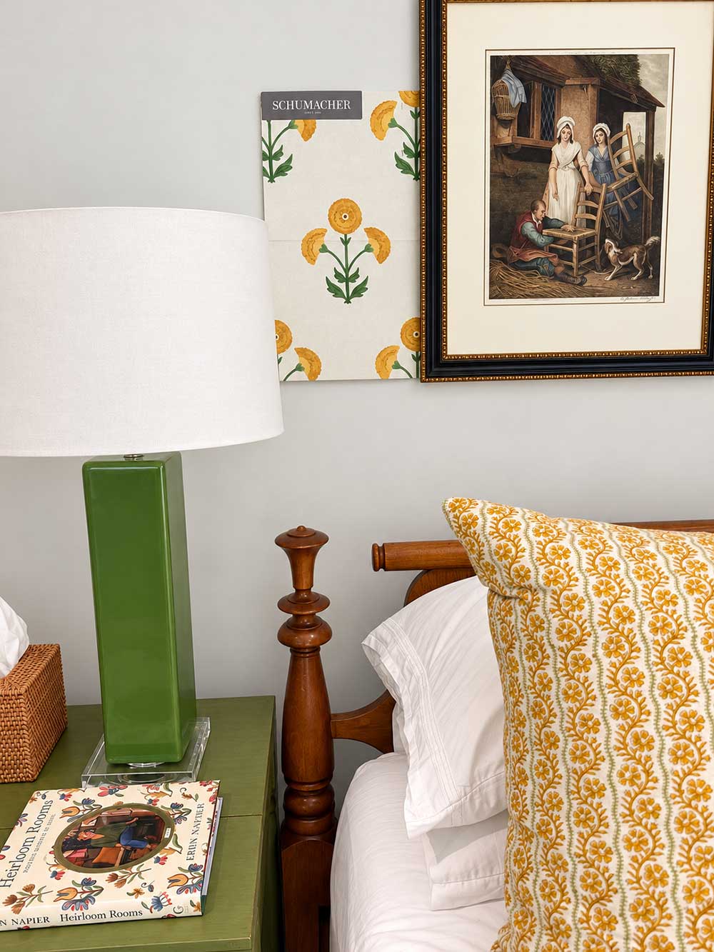
In my guest bedroom, which also doubles as my office, the wallpaper came first and everything else followed. I fell in love with Schumacher’s Saranda Flower pattern and then began selecting the furnishings and decorative elements to complement it. The design has a beautiful Indian-inspired quality, a motif I’ve been seeing more frequently in interiors and even in clothing. But it was really the yellow and green combination that caught my attention.
Green has been my favorite color since the third grade, and you’ll find it throughout my home. Yellow, on the other hand, was a color I hadn’t used in any of the rooms, and I wanted to introduce it somewhere. This wallpaper gave me the opportunity to bring the two colors together in a way that felt cheerful. I also incorporated another shade of yellow into the room by painting the furniture piece where I store my fabric books in Hay by Farrow & Ball. It’s a muted yellow that complements the wallpaper. I love mixing different shades of a color within a room. It creates more depth and interest than trying to match everything, and in this case, the wallpaper provided a wonderful starting point for the rest of the space
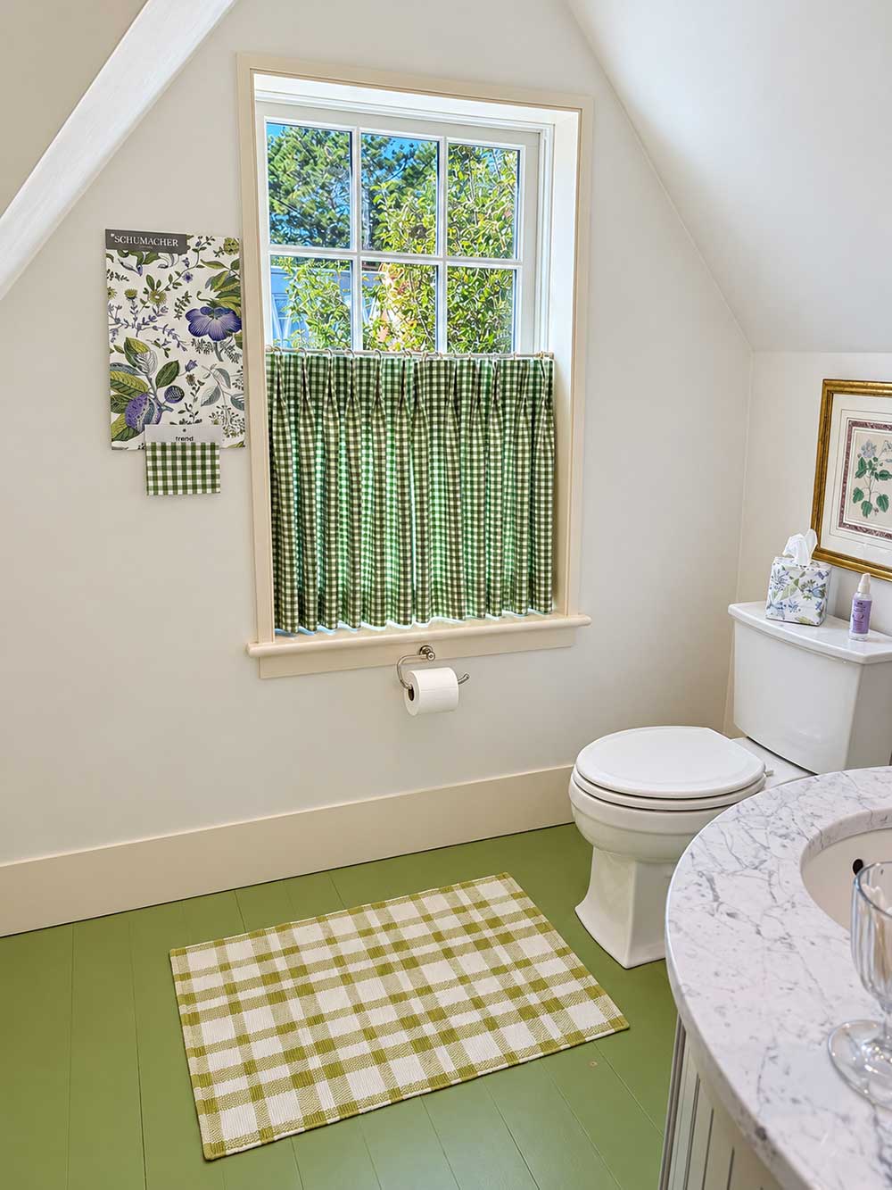
Sister Bathrooms: Schumacher – Pomegranate Botanical
Upstairs, I have two connected bathrooms, one with a shower and the other with a bathtub, which we refer to as the sister bathrooms. Wanting the colors and patterns to feel connected, I chose Shumacher’s Pomegranate Botanical. As with the guest bedroom, I fell in love with the wallpaper first and then went looking for a fabric to complement it. I eventually found a green check that I had curtains made from.
The wallpaper also gave me an opportunity to introduce a little purple into the room, while keeping green as the dominant color. I love using accent and complimentary colors to add interest. And, of course, I couldn’t resist using green again – even the floors in these bathrooms are green. I particularly like the combination of the wallpaper with the checked curtains.
Upstairs Hallway: Bennison Fabrics – Wheatflower
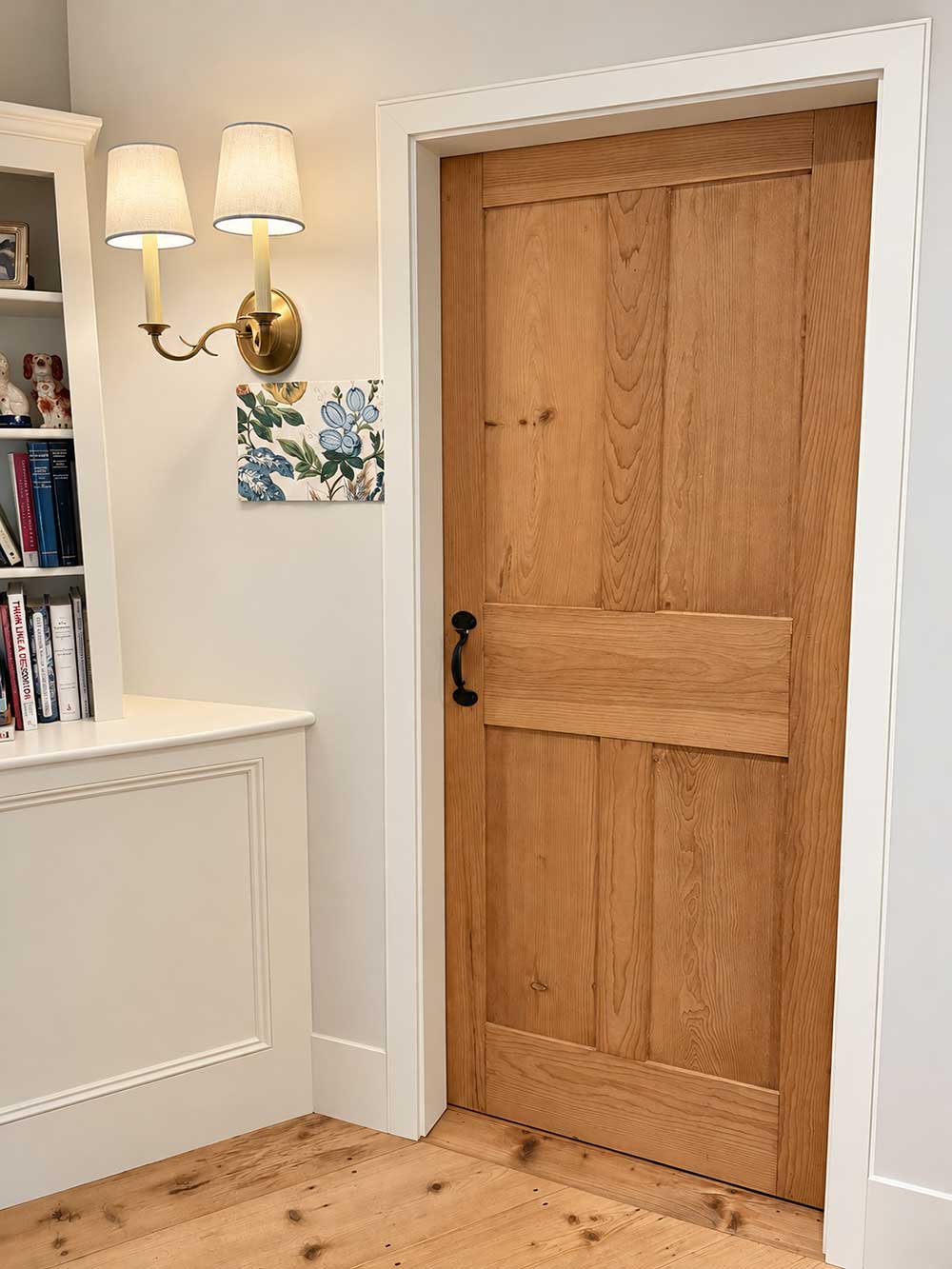
One of the perks of being an interior designer is spending time in showrooms surrounded by beautiful fabrics and wallpapers. Of course, that also means I’m constantly discovering things I’d love to use in my own home! That’s exactly how I found Wheatflower by Bennison Fabrics. I came across it while looking at options for clients and set it aside for myself. This pattern has an organic quality that brings the outdoors into the upstairs hallway.
Hallways are often overlooked when it comes to decorating. Just because they’re spaces we pass through every day, doesn’t mean they can’t have just as much personality as the rooms they connect. For me, this wallpaper was a way to add some whimsy into the hallway while continuing the nature-inspired feeling I’ve incorporated throughout the house.
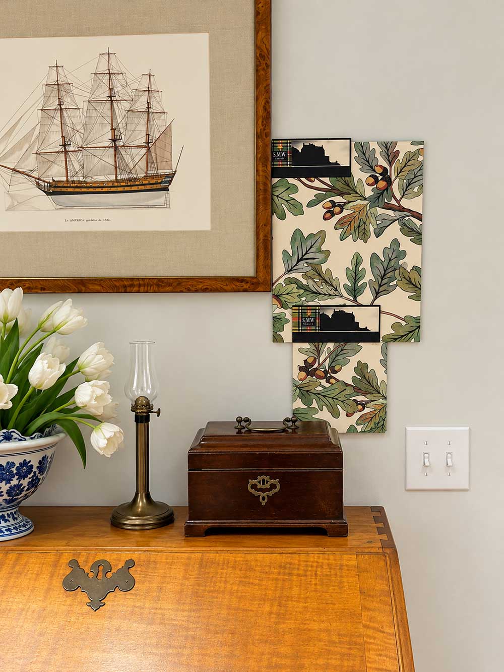
Downstairs Hallway
For the downstairs hallway, I chose Jacob Botanical Stripe by Scot Meacham, a bolder, repeating print of trees similar to the oak trees that dot the landscape here on Martha’s Vineyard. The curved leaves and acorns get me everytime. I love the strong repetition of the design and how it breathes life to the space. Hallways are great places to be a little adventurous with wallpaper, and this one packs a vibrant punch infusing an instant feel of nature into the space.
My Tips for Choosing Wallpaper
If you’re considering wallpaper for your own home, there are a few things to keep in mind. With so many beautiful patterns, colors, and textures available, it’s easy to fall in love with a design, but you also want to be sure it’s the right choice for your space.
Consider the Scale of the Pattern
The scale of a wallpaper pattern can have a tremendous impact on how it looks and feels in a room. Small, delicate prints work well in closets, bookcases, and small bathrooms where they can turn an otherwise ordinary space into a little jewel box. The important thing is to consider the scale of the paper in relation to the space.
Don’t Forget About the Ceiling
One of my favorite ways to use wallpaper, particularly in a small room, is to continue the pattern onto the ceiling. Carrying the wallpaper overhead creates an unexpected enveloping effect that can turn a powder room, small bathroom, or even a closet into a jewel box.
Always Live with Samples Before Making a Decision
This is probably my most important piece of advice: never select wallpaper without bringing samples home and living with them for a while! Hang the samples up with painters tape on the wall and look at them at different times of day. The true test is whether you still enjoy looking at it after the initial excitement wears off. I recommend keeping samples up for at least several weeks before making a final decision. As you’ve probably gathered from my own home, I sometimes take that advice a little further!
Wallpaper is a fabulous way to express your personality, but it’s also something you’ll be living with for years. So, taking the time to find a pattern you truly love is always worth it.
And if my Martha’s Vineyard home is any indication, there’s no need to rush the process. Some of my favorite choices have been years in the making, and I still have a few decisions ahead of me. That’s part of the fun of decorating a home over time, finding things you love and discovering exactly where they belong.
Ready to Get Started Transforming Your Space?
There are so many ways in addition to pattern to breathe fresh life into a home. View my Portfolio to see more examples of my interior design projects and follow us on Instagram for more interior design inspiration.